• supporting creativity in the classroom and beyond •

• supporting creativity in the classroom and beyond •
Showing posts with label contour drawing. Show all posts

what can you do with an old map?

Like a lot of people, I scout around on Pinterest for ideas. When I find an art activity that looks interesting, I post it to my own "Art Things To Try" Pinterest board. So the other day when I was getting ready to substitute in a friend's second grade classroom, I went looking on that board for something new to do. I landed on two different ideas that intrigued me. One was using bleeding tissue paper with just water to create colored paper; the other was creating a cityscape collage using the classified pages from a newspaper. Jumping off those two ideas, I came up with this cityscape idea.

To create the colorful background, the students used bleeding tissue paper, applied to wet paper. I happened to have an overabundance of blue and pink tissue paper, so I encouraged them to mix the blues and add a little pink to suggest a morning or evening sky. They just needed to brush on a little water, apply a torn piece of tissue paper, and continue applying sections of tissue until about half the paper was covered. We let it sit for about a half hour, then peeled off the tissue paper.

Since I had recently discovered about thirty old maps in my filing cabinet, we used those for the buildings. I cut up several, handed them out, and showed the students how to draw rectangles in between the folds with black marker or crayon, draw windows, and then cut them out. I suggested that they make eight or nine buildings of different sizes, and encouraged them to draw some interesting rooflines. I demonstrated putting the taller ones in the back with a little space between them, and then the shorter ones in front, to create a feeling of depth.

I love the colors of the buildings drawn on maps, and it was interesting to watch kids actually choose sections of maps to use. One student even flipped her map over and drew a building on the list of cities. The skies are particularly beautiful. We had talked about leaving white space to represent clouds, and many did, but the best part of this was that no glue was involved at all... just water! The colors are brilliant and the blending is actually more interesting than with a tissue paper (with glue) collage because the water helped bleed the tissue color more fluidly than glue.

This lesson will definitely go into my file for future use... and I still have a ton of maps!


The full lesson, available in my Teachers Pay Teachers store, has easy, step-by-step directions and includes an art reflection worksheet for students, designed to help them think about their own art work and their creating process. Enjoy!


still life contour drawing

Drawing is all about seeing, and still life drawing lessons are particularly good for emphasizing the importance of careful observation. When teaching this still life lesson, I started by "thinking out loud" to show how I observe and define shapes and lines. With a quick model drawing, I showed how to overlap items, talked about how those items in front are a little further down the page than those behind, and talked just a little about shadows and shading. Then I turned the kids loose with colored pencils in secondary colors only.

The drawing subject matter is always simply a collection of random items I have lying around the house, plus a few gems from a box I keep in the garage labeled "candles and trinkets".... you know... those items you don't really want to throw away quite yet, but don't really want out, either.

In this case, I also brought in a selection of colorful gourds and a bouquet of autumn-colored chrysanthemums, so each of three tables had a bud vase with flowers. Each table had a slightly different selection of items and every student already had a mini pumpkin on their desk so I invited them to add those to their drawings. I also suggested that they did not need to draw every item, that they could draw only those items they wanted to draw. Other directions included not to color everything in, and to think about overlapping and shading.

And to look, look, look very carefully at the items they were drawing.

I love the vastly different results from different students. Some drew small, some drew large, some overlapped the items, some had them lined up across the center of the page. Some paid great attention to details, others drew in a more general, stylized way.


This drawing lesson followed a "looking at art" activity in which we looked at Norman Rockwell's "Freedom From Want"... an activity that included talking about what was going on in the painting, which turned into talking about main ideas and details. If someone said it looked like Thanksgiving, I asked how they knew, which turned into a discussion about details. I thought that would be a nice segue into a "harvest" type still life drawing, but realized pretty quickly that I had too many generic items in the set-ups and not enough "harvest" items. Something to remember for next time!
Still life drawing is a great way to add a little seasonal art to the classroom, and it's a great way to integrate science, too! It requires practically no prep, other than gathering the items, and it's amazing how much attention some students will give to their drawings. This art lesson is available in my TeachersPayTeachers store. Look for Still Life For Kids:

looking at art with kids

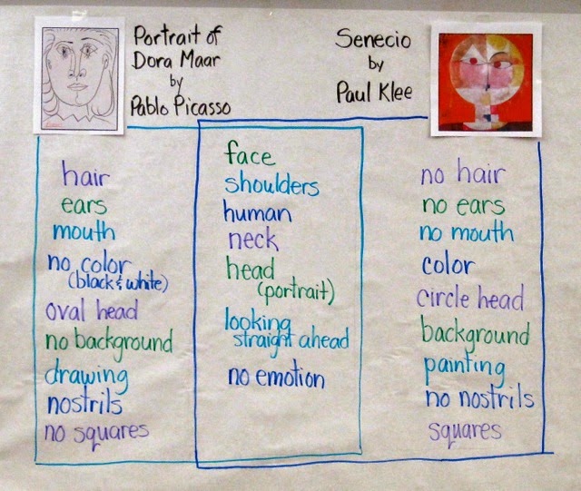
With the idea that I would have students do some "mystery paintings" of faces.... white crayon on white paper with watercolor resist overlay.... I started out by having them compare two works, one by Pablo Picasso and one by Paul Klee. I chose these two works because I intended to have them do a contour drawing of a face and then use color blocks of watercolor over the drawings, and these two works are perfect examples.

We started with my standard question: "What do you notice?" I charted the students' responses, encouraging them to identify whether their "noticing" was of the Picasso, the Klee, or whether it applied to both of the works. I asked students to use the artists' names rather than saying "the one on the left" or pointing and saying "that one" or "the round one" or "the pencil one." Those attributes that applied to both were charted down the center. Since these particular second graders are familiar with Venn Diagrams, they understood right away how to read this finished chart after I added the "boxes" around the lists.

On to the students' art making...

I started with a short demonstration of the "mystery painting" technique, drawing a large face with lots of lines for hair and showing students how I could almost see the drawing if I held the paper up to the light. I added a line pattern in the background for interest, and then modeled painting in blocks of color. I emphasized that I was not following the lines, but letting the drawing come through on its own as I painted.

Then I switched gears and decided to invite them to draw anything they wanted with white crayon on white paper. Together we brainstormed subject matter:  animals, flowers, landscapes, and... of course.... faces.

As they drew, I reminded students to press hard with the crayon and try to use the whole paper, either adding more to their subject matter or perhaps including a pattern in the background for interest. As they were ready, they painted over their drawings. 


These were just plain fun to do. Watercolor resist is a popular art-making activity and really does not need a lot of prep or explanation, but the introduction with these two art works gives an added art-appreciation and art analysis dimension to the lesson.

Looking at these two art works helps the students see how a face can take up a whole page, and to realize that one doesn't need to "follow lines" when painting. It also gives students the opportunity to see and talk about representational abstract art, and to become comfortable with the idea that a face drawing does not need to be absolutely realistic to be successful.

This art-making session ended with students writing about their art work. I gave them the choice of simply telling about their own process, describing how to create a "mystery painting," writing about the difference between Picasso's and Klee's faces, or comparing their own art work to either Picasso's or Klee's. Most students chose to just write about their own process, but two students did write comparisons... one compared his art work to Paul Klee's, and one compared the Picasso and Klee faces.

All in all, a successful lesson, during which a good time was had by all!


drawing on halloween

One day while looking through some images looking for something (I don't remember what), I saw a little orange and black witch profile art piece that got me to thinking. I had a subbing day scheduled the week before Halloween in a second grade class in which the students are particular adventurous, so I figured they would be a good group to try out a new lesson that would require them to use a viewfinder, make preliminary sketches, draw a large version of one of their small sketches, then crop their design, paint it, and frame it. I had visions of bold, black contour drawings with bright orange textured background, and lots of options for cropping.

It's hard to get some kids to draw something bigger than their pinkie, and I wanted them to draw large, and boldly, giving some attention to placement, scale, background, and detail. That's a lot for a second grader, but we went slowly and used pretty much the whole day for the lesson.

We started with a picture walk through the book Look! Look! Look! by Tana Hoban, then I taught them how to make a small viewfinder. I had them look at my face, move the viewfinder closer and further away, look at their own hand, and look around the room in general. This was to give them an opportunity to look at the environment the way an artist does, blocking out unneeded parts and just experimenting with placement in the viewing window.

The next step was generating a list of Halloween nouns, for them to use for ideas for drawing. This was followed by having them fold a piece of scratch paper into fourths and do four different small drawings. They chose one of these to draw bigger on a white paper, using only a black crayon, with instructions not to color anything in because these were contour drawings. I let them know that we would be painting them later.

Next, they made a cropping window and placed it over their drawing to help them choose how to crop their composition. This was kind of like using a giant viewfinder. They drew a pencil line for the cropping lines, then sponge painted inside that square with orange watercolor.

By now it was about one hour before the end of the day. There was just enough time left to cut on the pencil lines to trim the excess off their drawings and mount their "close up" compositions on black paper. And to show off.

After we had a chance to look at everyone's work, I had a few students choose someone else's picture and tell what they liked about it. They were remarkably articulate! "I like the collar." "I like the pattern in the background." "I like the spider web." "I like that it looks scary."

This turned out to be a pretty successful lesson with a lot going for it. The students were intrigued by the viewfinders, and I was thrilled to see that hardly anyone drew tiny pictures. I think making the preliminary sketches (and modeling that process) helped a lot. If I had wanted to stretch this lesson out even further, I could have had the students do all the measuring for their cropping window mats; I would definitely do that if I were teaching this to an older group. And just to show how great this class is, they put all the painting sponges back into color-coded baggies with no mistakes!


about sky...

I am always intrigued by the way kids will tackle sky. Often, they draw puffy clouds and then color them blue, leaving the "sky" part white. I will ask, "What color are clouds?" and they always say, "white" and I just say "hmmmm... yes they are...." and wander away, leaving them to ponder their blue clouds. So one day I decided to teach second graders a sky technique.

I started by having a discussion about what the word "landscape" means and what we might see in a landscape. I had them all look out the window and describe what was closest to the classroom (a few trees) and to notice how large they looked compared to the ones far away across the field. I had posted a sheet of 9x12 white paper on which, with a black Sharpie, I drew a couple of trees, fairly large. Then I asked what else might be there: Rocks. Water. Grass. Flowers. Bushes. I put in some of those things. Then I added some low hills in the background, then another layer of hills behind those, and some mountains behind those. 
I then colored in the sky with a broken, unwrapped crayon, using the side of the crayon and leaving some spaces white to suggest clouds. Their reaction? "Oooohhhh....." Another thing I modeled was using the sides of the broken crayons to do some "blending" in the foreground.

I gave them directions to draw a landscape, including hills and mountains in the background, by starting with the foreground and working back. They were to use a Sharpie (so double paper to keep the desks clean) and not color anything in while drawing. After they had the landscape finished, they were to color some of the landscape while leaving some parts white, and create their sky the same way I did. I decided to ask them to leave some parts white partly to save time and partly to focus on their drawings without getting them obliterated.  A few students tried the blending technique while they were coloring their landscapes.

The results were colorful, interesting, and fanciful.

They did a great job and I learned something, too. Most of the kids drew the tops of their mountains near the top of the paper, leaving very little sky space. The next time I try this, I will make sure to emphasize that they leave at least 1/3 of the space for sky. All in all, though, I think they did a great job! And they had a good time, too.

hands

On a day near the end of the school year, when I found myself substituting in a second grade classroom where I had never been before, for a teacher I had never met, in an emergency situation in which there were no lesson plans, the first thing I did was scout around the cupboards to see what art materials might be available. I found some white construction paper that had been cut to about 9x18, so I pulled it out, sorted through it for pieces that were not bent or torn, counted out enough sheets for the class, consulted my little folder stash of emergency ideas, and decided to have the students do some line designs with their hands.

I demonstrated on the white board what to do:  I traced my hand along with part of my arm, then drew five lines across the paper in different directions, crossing over the traced hand and extending the lines off the edges of the paper. I gave directions to color in all the spaces however they liked, and let them go to work. It was interesting to see that some students drew all their lines extending off two edges of the paper, while other students drew some of their lines stopping at other lines rather than crossing them.

These students had just had three substitute teachers in two days, so they were pretty antsy to begin with, but this activity pretty much captured everyone's interest. They didn't have to do a lot of thinking, but it did quiet them down and the results are actually pretty striking. This would be a great activity for any substitute teacher needing an hour to kill.

I could see doing this using only warm or cool colors, or warm colors in the hand spaces and cool colors in the background spaces, or patterns in the hand spaces with plain colors in the background spaces (or vice-verse), or using only three analogous colors, or different values of one color, or using watercolors, or pastels, or adding textured rubbings, or doing it with two hands, or three hands....

I'm pretty sure this is something I will do again. It was easy, fun, interesting, and needed no planning whatsoever!

flowers and landscapes inspired by georgia o'keefe

Last week of school.... subbing in a friend's third grade classroom... I want to do some art but not a real formal lesson.... so I decide to show some flowers and landscapes by American artist Georgia O'Keefe and then basically let the students choose which they want to do.

They were pretty intrigued by O'Keefe's work, which precipitated several comments. I followed up the O'Keefe examples with several close-up photos of flowers and several photos of various landscapes, then did a quick demonstration of drawing a quick, light pencil sketch of a landscape and another of a close-up flower. For the landscape, I pointed out how there were several "layers" of mountains, and that trees in the foreground would be larger than trees in the background. That was pretty much it for the lesson. I then transferred one of the sketches to *real* watercolor paper, traced over the pencil lines with crayon, then used a wet-on-wet watercolor technique, focusing on letting colors blend.

I asked students to do two preliminary sketches, one a flower and one a landscape. For these I gave them each one 12x18 sheet of drawing paper. Folded in half, it gave them two "real size" clean surfaces on which to draw the sketches. I gave each student some feedback on each drawing, then asked them to choose which one they wanted to do. Once that was decided, they got a sheet of 9x12 watercolor paper and went to work.

As they worked, I made some suggestions here and there, occasionally spraying their papers with a spritzer water bottle to make them wetter if they were not using enough water (typical for some). Since it was a very hot day (101 in the shade!) a few got spritzed on the head, too.

The whole lesson, from showing the art and photos to finished student products took about two hours. There were no behavior issues during this time, as all students were pretty much engaged right from the beginning.

The results are generally pretty good, although I learned some things which I should know by now. For one, I really need to make a hard and fast rule not to mix orange and violet, since my subtle suggestions ("You really might want to not mix the orange and the violet together") often go largely ignored. Thus, there are a few muddy results, but overall I think they would make a good display. I was happy that landscapes to flower ratio was pretty much 1:1. What was a little disconcerting was that *most* of the flowers were shaped exactly like my example sketch. Note to myself:  Do several models, not just one.


.


wax resist

This week, I did a wax resist activity with a second-grade class that has done many, many art lessons with me. They know my basic art behavior rules -- look carefully.... think about your work.... choose colors thoughtfully... THEN do the art. I always try to give enough direction without being too detailed, because I want kids to be creative AND end up with something they are proud of, so for this adventure in wax resist I gave them some choices of "what to draw" -- a sun design, landscape, cityscape, or flowers. I showed them a few samples of my own tries, which I took away after they looked at them. The "rules" were to use a light color crayon and only two colors of paint.

I've done wax resist lessons with black crayon, white crayon, colors, whatever. This time, it was light crayons only, with the idea that the paint would be dark. I didn't think to tell them that if they used a yellow crayon, they should not use yellow paint, so some are not as contrasting as they could be. The biggest success of this particular activity was that every student was totally engaged in both their drawings and their painting process. Overall, they had fun

Kids usually like working with wax resist. They seem to think it's like magic that the paint is resisted by the crayon, and they do become very engaged in the process. But I have found that the technique can be tricky. For one thing, students don't always press hard enough with the crayons, so the crayon doesn't come through as it should. They also seem to have a hard time getting enough paint onto the brushes, resulting in a washed-out composition. And, they have a tendency to want to use every color in the watercolor pan, resulting in a kind of mess, especially if they ignore me when I suggest that they not paint on top of paint. When I had my own art classroom, I took all the black and brown paint out of the pans, for just this reason

We did end up with some pretty good results AND I got a few more ideas about how to present the lessons. For one thing, I need to remember to remind them that if the crayon is light, they need to use darker colors of paint, and plenty of it, so that the crayon will come through. And vice-versa.
.

more hearts

It's February, so I'm doing hearts with kids. All kinds of hearts. These patterned hearts with watercolor overlay were done with a first grade class, after a discussion about what makes a pattern a pattern. I love asking this question of little kids... it's always such an interesting discussion. Once we get to the idea that a pattern is something that repeats, then I am ready to move on into using patterns in some kind of art activity.

For this activity, I taught the students how to cut a "thumb heart" by folding a small piece of tagboard, making a fist, putting the folded side into the space between the thumb and the fist, and then cutting around the thumb. Sometimes it works. Well, most of the time it works, except when the student puts the folded side out by accident, or when he or she forgets to cut around the thumb and goes off the edge. But no matter, because I always bring hearts for tracing anyway.

Students are given their choice of using their own heart or one of mine. I show them how to trace three or four hearts onto a piece of 6x12 white construction paper, overlapping them, and then I model drawing different line patterns in the spaces with a black crayon. For this part, I choose kids with some kind of pattern on their clothes, and show how to transfer that pattern to paper. Then I show them how to use the watercolors (brush straight up, not smooshed into the paper, with a good amount of water to make a puddle in the paint). Then I send them off to work and help those who need a little assistance.

Cutting around the hearts and mounting them on black paper makes them look even better!


.

hearts

One of my pet peeves in children's art work is the use of cliches like hearts, rainbows, and suns in the corner, which have a bad habit of appearing in drawings willy-nilly, just because the student is falling back on known shapes rather than exploring new ones. Some will disagree with me, but that's where my thinking is. Anyway, that doesn't mean I dislike hearts, rainbows, or suns... I just want them to be necessary in the art work.

In this activity, the heart is the only subject matter. It is an easy, easy, easy activity that is practically foolproof. It requires no prep; all that's needed is white construction paper (we used 9x12, but a bit smaller would work, too) and crayons. To introduce the activity, I showed an example of a piece of art work by Jim Dines, who has done tons of art with hearts. I had students tell what they noticed and wrote their responses on the board next to the photograph (see photo at the end of this post). After this introduction, we reviewed warm and cool colors and I explained that students would need to draw a very large heart (I demonstrated) and that they would fill the heart with warm or cool colors (their choice) and the background with the opposite palette. I gave a short little demonstration to show how to color to make it look "markerish" .... that was one of the students' observations.... and then sent them off to go to work. I did wander around and show some of the students individually how to put color in smallish patches, but otherwise they were pretty much on their own.

When the color was done, most students outlined the heart with black crayon, then chose a mounting color that was from the same palette as the colors used in the heart. This took most students about an hour to complete, and some of them worked during lunch time. It turned out to the a perfect activity for a rainy, rainy Friday in a second grade classroom!


.

cityscapes on watercolor background

This second grade lesson combines a watercolor wash, drawing with construction paper crayons, symmetry, and a little color theory. In another version, students draw symmetrical cityscapes on black paper, but one day I came across sunset cityscapes at the TeachKidsArt blog which inspired me to combine the two ideas.

First, students use sponges and either warm or cool colors for the washes. They wet the whole paper first with the sponges using clean water, then fill the paper with color, either stroking or blotting the paint. If papers are not wet enough, I am right there with a spritzer bottle. :-). I have them use sponges for the wash because I don't have any large-sized watercolor brushes. The sponges have the additional benefit of adding some interesting texture. The washes are put aside for later (in our case, this is weeks later).

For the cityscape drawing lesson, I first have students observe and discuss several photographs and art examples of cityscapes. Then I ask them to tell me what they know symmetry. The most common responses usually refer to a line, so I use questioning to bring the discussion around to what it means to be symmetrical, and how we know something is symmetrical. I also introduce the word bilateral, explaining that "bi" means "2" and "lateral" means "side" -- this leads students to the idea that bilateral symmetry means that two sides are the same.

The cityscape is drawn on black construction paper using construction paper crayons (which they love!). I suggest that students first draw a horizontal base line, then start with the center building. They color in doors, windows, and roofs before adding two identical buildings on each side of the center one. They work out from the center two buildings at a time, coloring in all details. When the drawings are complete -- that is, they have drawn as many buildings as will fit -- they cut around the buildings and glue the silhouette onto their own watercolor wash.

After students have a chance to walk around and see everyone else's work, I have them discuss with a partner what they like most about their composition, and explain how they used bilateral symmetry.

observation drawing: people

I am not a fan of stick people. Children, I think, draw stick people because adults have taught them to do so. As a primary classroom teacher for ten years, I expected my students to always draw people with body parts, clothing, and details.

Now that I am teaching Art to young children, I have a mission to eradicate classrooms of stick people. This lesson with second graders asks them to closely look at another student and to draw a person using that student's clothing for inspiration. It is done with colored pencils on white drawing paper.

This lesson is partly a directed-draw lesson and partly an observation drawing lesson. I introduce the term "contour drawing" and define it as the outline shape of something. I have students look closely at shapes and contours in clothing, shapes of heads, arms, bodies and legs, direction of contour lines, and proportion of body parts to each other.

I talk students through the drawing of the person across from them at their table: an oval near the top of their paper for the head, the neck lines, shoulders, the shape of the shirt or blouse, short or long sleeves, pant legs or skirt and legs, then arms, fingers, and shoes. Finally, we look at different hair styles, and I emphasize that hair grows down, not up, and that it is drawn with lines, not shapes.

During the drawing process, I use my own clothes and body for reference; I do some modeling on the white board, but make sure to have them always refer to the person they are drawing for shapes, sizes, and details.

Once the contour drawing is done, I have students color in their drawing using the colors of and details on their partner's clothing. I ask students not to add faces because I want them to have time to draw another person and we will have a face drawing lesson another day. When this first drawing is finished, students then choose a different model and draw that person next to the first drawing.

This lesson ends with a reminder to students that they never need to draw stick people again, because now they know how easy it is to draw a person with a body and clothes. :-)
.

leaf observation drawing with watercolor

When doing art lessons, especially drawing lessons, I like to emphasize that artists do four things: look.... think.... choose.... do. This lesson is a great introduction to that four step process because close observation is vital to its success. This drawing lesson begins with a whole-group "picture walk" of about five or six close up photographs of fall leaves,  followed by students observing and discussing the characteristics of a variety of real leaves. If I have time, I chart their observations.

A quick demonstration of drawing a leaf includes "thinking out loud" as I model giving attention to the shape, the direction of the contour, angles and curves, etc. A quick introduction or review of how to care for and use the watercolors completes the introduction.

Before students begin their drawings, they are asked to look carefully at several leaves and think about which leaf they want to draw, how they will place it on the paper, and other aspects of putting together their composition. This reinforces the "look...think...choose....do" process.

While they draw, I might give some tips about placement and/or layering. There is usually a great variety of finished work. Some students may have four or more leaves in their work, while others may have only one. As they paint, I give watercolor technique tips as needed.

When all work is finished and all watercolors and brushes are cleaned up, I like to have students do a "gallery walk" around the room to look carefully at everyone's finished work. I ask them to look for interesting shapes and colors and then we come together and share the observations.

This lesson is a true favorite. It integrates science and art in several ways, not only with the leaves as subject matter but also the act of doing an observation. Adding a related writing component extends it even further!

This lesson is included with another wax-resist autumn leaf art lesson in Art Lessons With Autumn Leaves, one of the art lessons in my TeachersPayTeachers.store. The lesson bundle includes detailed instructions, some leaf templates for tracing (for younger students), drawing tips, a few writing extension ideas, and more.


bubble people


I have a pet peeve: stick people. So I thought... well... might as well start at the beginning. I came across a people drawing lesson in "Talking, Drawing,Writing" by Martha Horn and Mary Ellen Giacobbe, a book about art and writing that starts with using ovals for every body part. My first idea was to do this lesson with all the students and then have the Kindergartners draw clothes on them, the first graders fill the ovals with patterns, and the second graders do elaborate warm/cool compositions by filling the people ovals with warm or cool parallel lines and then doing a background in the opposite color. Heh. I was a little overambitious on the second grade idea. We were lucky to get the person filled with lines, although a few students did manage to go on to a second bubble person, as they came to be known.

This lesson, for all three grade levels, started with a "loosening up" exercise with a large sheet of white paper on which they practiced drawing dots, circles, ovals of different sizes and shapes, and assorted lines. Then Kindergartners had a read aloud - "From Head to Toe" by Eric Carle (which included much wiggling, clapping, stomping, and kicking) - and everyone learned how to use ovals of different sizes, shapes, and lengths for all the main body parts. Kindergartners were asked to color their bubble people any way they wanted, and as they finished, to draw more on their practice paper. First graders filled theirs with dots and lines, using two primary colors, and those who had time were able to mount them on the third primary color. One creative first grader decided to mount his standing on one hand, and was careful to remind me that it goes "this way." :-) Second graders drew a contour line around their bubble person to define the shape. They then filled the complete shape with warm or cool colored parallel lines. If they finished one, they were asked to draw another on the same paper and to fill it with lines using the same colors.

Everyone did a great job! During sharing we looked at how different they all were, and students were able to talk about what was hard to do, what they liked about their bubble people.

Now... if it will just stick, there will be less stick people in the world! :-)
.