• supporting creativity in the classroom and beyond •

• supporting creativity in the classroom and beyond •
Showing posts with label painting. Show all posts

looking at art with kids

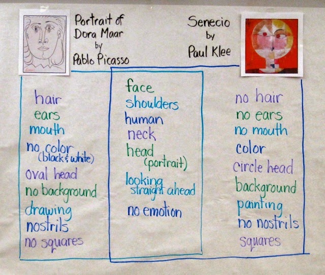
With the idea that I would have students do some "mystery paintings" of faces.... white crayon on white paper with watercolor resist overlay.... I started out by having them compare two works, one by Pablo Picasso and one by Paul Klee. I chose these two works because I intended to have them do a contour drawing of a face and then use color blocks of watercolor over the drawings, and these two works are perfect examples.

We started with my standard question: "What do you notice?" I charted the students' responses, encouraging them to identify whether their "noticing" was of the Picasso, the Klee, or whether it applied to both of the works. I asked students to use the artists' names rather than saying "the one on the left" or pointing and saying "that one" or "the round one" or "the pencil one." Those attributes that applied to both were charted down the center. Since these particular second graders are familiar with Venn Diagrams, they understood right away how to read this finished chart after I added the "boxes" around the lists.

On to the students' art making...

I started with a short demonstration of the "mystery painting" technique, drawing a large face with lots of lines for hair and showing students how I could almost see the drawing if I held the paper up to the light. I added a line pattern in the background for interest, and then modeled painting in blocks of color. I emphasized that I was not following the lines, but letting the drawing come through on its own as I painted.

Then I switched gears and decided to invite them to draw anything they wanted with white crayon on white paper. Together we brainstormed subject matter:  animals, flowers, landscapes, and... of course.... faces.

As they drew, I reminded students to press hard with the crayon and try to use the whole paper, either adding more to their subject matter or perhaps including a pattern in the background for interest. As they were ready, they painted over their drawings. 


These were just plain fun to do. Watercolor resist is a popular art-making activity and really does not need a lot of prep or explanation, but the introduction with these two art works gives an added art-appreciation and art analysis dimension to the lesson.

Looking at these two art works helps the students see how a face can take up a whole page, and to realize that one doesn't need to "follow lines" when painting. It also gives students the opportunity to see and talk about representational abstract art, and to become comfortable with the idea that a face drawing does not need to be absolutely realistic to be successful.

This art-making session ended with students writing about their art work. I gave them the choice of simply telling about their own process, describing how to create a "mystery painting," writing about the difference between Picasso's and Klee's faces, or comparing their own art work to either Picasso's or Klee's. Most students chose to just write about their own process, but two students did write comparisons... one compared his art work to Paul Klee's, and one compared the Picasso and Klee faces.

All in all, a successful lesson, during which a good time was had by all!


flowers and landscapes inspired by georgia o'keefe

Last week of school.... subbing in a friend's third grade classroom... I want to do some art but not a real formal lesson.... so I decide to show some flowers and landscapes by American artist Georgia O'Keefe and then basically let the students choose which they want to do.

They were pretty intrigued by O'Keefe's work, which precipitated several comments. I followed up the O'Keefe examples with several close-up photos of flowers and several photos of various landscapes, then did a quick demonstration of drawing a quick, light pencil sketch of a landscape and another of a close-up flower. For the landscape, I pointed out how there were several "layers" of mountains, and that trees in the foreground would be larger than trees in the background. That was pretty much it for the lesson. I then transferred one of the sketches to *real* watercolor paper, traced over the pencil lines with crayon, then used a wet-on-wet watercolor technique, focusing on letting colors blend.

I asked students to do two preliminary sketches, one a flower and one a landscape. For these I gave them each one 12x18 sheet of drawing paper. Folded in half, it gave them two "real size" clean surfaces on which to draw the sketches. I gave each student some feedback on each drawing, then asked them to choose which one they wanted to do. Once that was decided, they got a sheet of 9x12 watercolor paper and went to work.

As they worked, I made some suggestions here and there, occasionally spraying their papers with a spritzer water bottle to make them wetter if they were not using enough water (typical for some). Since it was a very hot day (101 in the shade!) a few got spritzed on the head, too.

The whole lesson, from showing the art and photos to finished student products took about two hours. There were no behavior issues during this time, as all students were pretty much engaged right from the beginning.

The results are generally pretty good, although I learned some things which I should know by now. For one, I really need to make a hard and fast rule not to mix orange and violet, since my subtle suggestions ("You really might want to not mix the orange and the violet together") often go largely ignored. Thus, there are a few muddy results, but overall I think they would make a good display. I was happy that landscapes to flower ratio was pretty much 1:1. What was a little disconcerting was that *most* of the flowers were shaped exactly like my example sketch. Note to myself:  Do several models, not just one.


.


wax resist

This week, I did a wax resist activity with a second-grade class that has done many, many art lessons with me. They know my basic art behavior rules -- look carefully.... think about your work.... choose colors thoughtfully... THEN do the art. I always try to give enough direction without being too detailed, because I want kids to be creative AND end up with something they are proud of, so for this adventure in wax resist I gave them some choices of "what to draw" -- a sun design, landscape, cityscape, or flowers. I showed them a few samples of my own tries, which I took away after they looked at them. The "rules" were to use a light color crayon and only two colors of paint.

I've done wax resist lessons with black crayon, white crayon, colors, whatever. This time, it was light crayons only, with the idea that the paint would be dark. I didn't think to tell them that if they used a yellow crayon, they should not use yellow paint, so some are not as contrasting as they could be. The biggest success of this particular activity was that every student was totally engaged in both their drawings and their painting process. Overall, they had fun

Kids usually like working with wax resist. They seem to think it's like magic that the paint is resisted by the crayon, and they do become very engaged in the process. But I have found that the technique can be tricky. For one thing, students don't always press hard enough with the crayons, so the crayon doesn't come through as it should. They also seem to have a hard time getting enough paint onto the brushes, resulting in a washed-out composition. And, they have a tendency to want to use every color in the watercolor pan, resulting in a kind of mess, especially if they ignore me when I suggest that they not paint on top of paint. When I had my own art classroom, I took all the black and brown paint out of the pans, for just this reason

We did end up with some pretty good results AND I got a few more ideas about how to present the lessons. For one thing, I need to remember to remind them that if the crayon is light, they need to use darker colors of paint, and plenty of it, so that the crayon will come through. And vice-versa.
.

mixing colors

The whole point of this activity is to let my second grade students mess around with primary colors to make secondary colors. I also throw in a little mini-lesson on using the brush appropriately and encourage students to not only use equal amounts of two primary colors, but also to use UNequal amounts to create different shades.

Rather than have all students use all three colors, I set up each of three large tables with two primary colors of tempera paint in small containers: one table with red and yellow, one table with blue and yellow, and one table with blue and red. Students choose which table at which to paint. Each student gets a small paper plate on which to mix paint, and a medium-sized round watercolor brush.

My directions are pretty basic: I suggest that they use the paper plates to mix colors, and make sure they understand that they don't need to paint a picture of something but that they can just play around with lines, shapes, and patterns. I also ask that their finished painting have at least three different colors. This confuses some students, but I try not to say more than that.

The first time I did this activity I figured that, at the very least, students would use both primary colors and one mixed color. I found that some students used only mixed colors and figured out on their own that adding more of one of the primary colors would alter the color. Others needed a little creative questioning: "How much red did you use?" "What would happen if you used more yellow?" and the like.

For some students, color mixing is not new. For others, and a surprising number of them, they are surprised to get green or orange or purple. I find that kind of sad. Some students like to paint a picture of something, others are happy to play with lines, shapes, or patterns. I was surprised and curious to find some students spending an inordinate amount of time painting the paper plate itself and avoiding the paper altogether.

Discussion is pretty basic, relating to which primary colors create which secondary colors. It is during the discussion that I introduce the words primary and secondary, and show a color wheel.