• supporting creativity in the classroom and beyond •

• supporting creativity in the classroom and beyond •
Showing posts with label color. Show all posts

on coloring

Coloring is big right now. Real big. Everywhere you look, you see coloring books. Adults are coloring big time. So it's not just for kids anymore.

So what's the deal?

Coloring is relaxing.
Coloring is meditative.
Coloring is great for fine motor practice.

But let's be honest. Coloring other peoples' drawings is not the same as making art.


As an art teacher who works hard to make sure that my art lessons are a combination of instruction in specific techniques or subject matter and a focus on kids' own creativity, the proliferation of coloring books and the focus and attention on coloring is something I look at with a dubious eye, because I know that a drawing of a family created by a child is so much more interesting than a coloring page of a family.

Coloring is fine, but it should not be used replace real art instruction, especially in today's standards-based, test-heavy classrooms where students creative opportunities are already cut to the bone.

Don't get me wrong. I am not anti-coloring. But I am pro-art education, and I know the value of allowing students to create their own masterpieces. That can never be done with a coloring page, because all the student is doing is filling in somebody else's idea. A student who draws herself inside a tent on a rainy day with the sun shining and flowers growing is learning a whole lot more than a child coloring in a traditional picture drawn by an adult.

In classrooms, coloring pages are often used as filler, handy for when a student finishes an assignment, or easy for a rainy day recess. And there's nothing wrong with this, as long as we recognize what it is: a relaxing activity that might help develop concentration, eye-hand coordination, and small motor skills.

But please, please, let's not call it art.

If teachers must use coloring pages in the classroom, I would at least like to see them add a bit of a challenging twist by giving students some parameters:
• use only analogous colors
• use only two contrasting colors, and do some shading
• use only one color, with different values
• draw and color a linear pattern in the background
• use only primary, secondary, or tertiary colors

Or better yet.... give kids some blank paper and a marker and let them create their own coloring pages! Or give them scissors, paper and glue and see what they come up with!

But most importantly, don't tell kids they get to do art and then hand out a coloring page.....

.... because coloring is not the same as making art.


Check out my TeachersPayTeachers store for teacher-friendly, authentic art lessons that rely on student creativity and which easily integrate across the curriculum. Enjoy!

Need some ideas? Start with this free resource: Making Time for Art.

flowers, shading, and the creative process

It's a common art lesson: close-up, enlarged flowers inspired by Georgia O'Keeffe's paintings. In this case, instead of paint, we used oil pastels. And because this particular second grade class had not used them before, I did do some modeling before turning them loose to work, showing them how to put down a bit of color and then spread it out with their fingertips to create the shading. They came up with the word smear during the demonstration.

First we did look at several examples of O'Keeffe's flower paintings. I chose ones that showed the centers, and made sure I had at least a few that went "off the page" because that was what I was going to ask them to do. They noticed that her paintings used bright colors, that the centers of the flowers had extra petals or other interesting parts, and one student noticed that there was a lot of shading. Yes! So on the chart I was creating, I set that word aside and gave it some prominence. I also wrote the word close-up off to the side, and reiterated that they would draw a flower in close-up, then shade it.

To demonstrate how to draw the flower itself, I showed them how to position a loosely drawn circle near the center of the paper, but not directly in the center, they to draw petals that went totally off the paper. I made a dramatic display of completing the petal shapes -- in the air, but not drawn -- going beyond the paper's edges. After demonstrating how to use the pastels, I posted several large, close-up photographs of flowers and had them take a look at color, shape, and some of the details in the centers of the flowers. I had intended to get into a discussion about radial symmetry, but decided to leave that for another time.

So I sent them off to create their own.

And we ended up with some beautiful results.

But before we got to this end point, some interesting things happened. Like one student doing the shading with the side of her fist. Like another student pressing some of the oil pastels so hard that the color was thick on the paper, with tactile texture, and the black lines from the Sharpies were missing. Like a few of the students deciding to color their flowers with each petal a different color.

I don't know if it's right or wrong, but I redirected these multi colorings in a direction that was more scientifically accurate, such as petals that were the same all the way around, whether they were one color or several colors.

So I learned some things, too, and had some things to consider. Like, how much modeling is enough? How much is too much, and how much is too little? Like, how much explanation is necessary? Like, at what point should a teacher just let the students mess with the colors, and at what point does the teacher step in and suggest something that is liable to produce a result that is more likely to follow the initial directions?

I want them to be creative, but I also want them to learn art technique that works, how materials are used to their best advantage, and to end up with a successful piece of art work that still shows their personality, and not mine. And most of all, I want them to think about what they are doing in the process, to take care with it, care about what they are doing, and like and be proud of it when they are finished.

I think these pretty much fit that bill:


haiku for all seasons

Second Grade Work
Haiku is one of my personal favorite poetry genres, rich with images, spare of words. Teaching children to write Haiku is not difficult, and it gives them a little practice with syllabication. It's a great supplement with units on seasons, animals, habitats, or other science topics!

For this lesson, the Haiku writing is only the first part; to me, they are incomplete until illustrated. I have done this lesson with second graders, at-risk students, English language learners of all elementary grades, and with fourth and fifth graders. The basic format of the lesson is identical for each of these groups; differentiations are made for specific needs. For example, a little more work on syllabication with second graders and English-language learners, and a push for more rich and detailed vocabulary with older students.

Second Grade Work
It's important to help students understand that Haiku does not tell a story, but simply presents an image for the reader to visualize. And I always tell students that it's more important to get a clear, beautiful image than to have the exact syllabication, so a little fudging is allowed. 
I always do a shared writing activity first, writing a Haiku with students. I model making a word bank, trying out different words, testing the syllables, and trying substitute words if the syllabication is not correct. But that 5-7-5 pattern can be tricky, especially for little ones, so I do make sure they know it's ok to leave a syllable out or add an extra, if they can't make their image work with the words they want to use.

Fourth Grade Work
Children can write a Haiku pretty quickly if they have an abundant word bank, so I do like to have them try two or three and then choose their favorite for publishing with illustration. Most often, I have students do a torn paper collage for the illustration, but cut paper collage, drawings, and even just a colorful tissue paper collage are just as beautiful.

Illustrated Haiku is a wonderful way to integrate Art with Language Arts, and it also can easily connect to Science as well. Any nature-oriented subject matter is appropriate, and the results make a beautiful, colorful, and maybe even informative bulletin board display.

This lesson, Illustrated Haiku for All Seasons, is available in my Teachers Pay Teachers store for those who would like step-by-step directions.
.


what can you do with an old map?

Like a lot of people, I scout around on Pinterest for ideas. When I find an art activity that looks interesting, I post it to my own "Art Things To Try" Pinterest board. So the other day when I was getting ready to substitute in a friend's second grade classroom, I went looking on that board for something new to do. I landed on two different ideas that intrigued me. One was using bleeding tissue paper with just water to create colored paper; the other was creating a cityscape collage using the classified pages from a newspaper. Jumping off those two ideas, I came up with this cityscape idea.

To create the colorful background, the students used bleeding tissue paper, applied to wet paper. I happened to have an overabundance of blue and pink tissue paper, so I encouraged them to mix the blues and add a little pink to suggest a morning or evening sky. They just needed to brush on a little water, apply a torn piece of tissue paper, and continue applying sections of tissue until about half the paper was covered. We let it sit for about a half hour, then peeled off the tissue paper.

Since I had recently discovered about thirty old maps in my filing cabinet, we used those for the buildings. I cut up several, handed them out, and showed the students how to draw rectangles in between the folds with black marker or crayon, draw windows, and then cut them out. I suggested that they make eight or nine buildings of different sizes, and encouraged them to draw some interesting rooflines. I demonstrated putting the taller ones in the back with a little space between them, and then the shorter ones in front, to create a feeling of depth.

I love the colors of the buildings drawn on maps, and it was interesting to watch kids actually choose sections of maps to use. One student even flipped her map over and drew a building on the list of cities. The skies are particularly beautiful. We had talked about leaving white space to represent clouds, and many did, but the best part of this was that no glue was involved at all... just water! The colors are brilliant and the blending is actually more interesting than with a tissue paper (with glue) collage because the water helped bleed the tissue color more fluidly than glue.

This lesson will definitely go into my file for future use... and I still have a ton of maps!


The full lesson, available in my Teachers Pay Teachers store, has easy, step-by-step directions and includes an art reflection worksheet for students, designed to help them think about their own art work and their creating process. Enjoy!


coloring

Sometimes I work backward, like with this little color theory activity. One day on Facebook I came upon a free turkey-coloring page that was filled with pattern. Normally I avoid coloring pages like the plague, preferring students to be creating their own drawings. But there was just something about this one. I thought maybe I could give some color instructions, like use all warm colors or all cool colors.

But then I had another idea: use analogous colors.

Rather than just tell students what analogous colors were, we would make a color wheel!

I thought all this through on the drive to school (40 minutes, mountains to valley, a view to die for... but I digress....)

I started by having students draw a large, equilateral triangle on the top half of their paper. It had to be large, so I checked for size right away. If it seemed small, I had them turn it over and make it bigger. That triangle was superimposed by another triangle the same size, but "upside down" (which, of course, is a misnomer, since a triangle is a triangle no matter what direction it sits in, but I digress again....)

At the very top, I asked them to make a yellow circle and color it in, then do a red and blue on the other vertices of the first triangle. They knew what happened when red and yellow, blue and yellow, and red and blue are combined, so we drew and colored in circles of those colors in their appropriate vertices.

Under these triangles, I had them note "primary colors" and "secondary colors" and then we went on to the tertiaries. (I love that a box of crayons has all the colors one needs for this, but again, I digress...)

Finally, we were able to talk about those analogous colors... the ones next to each other. Once I felt confident that most of the students could identify three analogous colors using the color wheel (I had made a large one, along with them, as a model), I showed them the turkey page and gave directions to choose four analogous colors for coloring. The key was to have them show me their color choices before I gave them the coloring page. If they had an outlier, I asked them to look again.
As they finished coloring their turkeys, I had them write "This turkey is analogous." on their paper and then write on the back of the paper what analogous colors are.

They had a great color lesson, a relaxing coloring session, and got a little writing in to boot. I found something interesting to do with a plain old coloring sheet. Win-win for everybody!

The coloring sheet was found at http://doodle-art-alley.com.

art goes back to school


In the back-to-school preparation frenzy, art education is the last thing on many, if not most, teachers' minds. And yet, what could be more fun... and even relaxing... than a little art during the first week of school? Best of all, teachers can find out a lot about students' fine motor and other skills, as well as their work habits and level of responsibility and concentration. 
One of my favorite things to do as an art teacher was to start the year with a little multimedia exploration. I set it up like Kindergarten stations, with four different media on four different tables for 1st and 2nd graders, and 3 different media on 3 tables for Kindergarten. Students started in one place and took their papers with them to the next station and added to their design. Kindergarten students used the same paper for the whole exploration, while 1st and ends used two sheets of paper, mixing two media on each paper.
First and Second stations included all of these, and Kindergarten stations were the same, minus the paint:
• tempera paint with brushes and straws for blowing
• crayons
• colored pencils with shapes to trace
• construction paper, scissors, and glue
It took a little extra thinking to decide in which order to arrange the stations for rotation, because each group of students started with a different media, and I wondered how feasible it was going to be for those who started at the paint table. In the end, I decided to just not worry about it and see what happened. Before starting the activity, I quickly introduced the materials at each station and explained the procedure, including making a point of explaining to students that they would keep the same paper when they moved to a new station. Other than that, I didn't really give any earth-shattering directions, because I really did want this to be an exploration.
An interesting side benefit of this activity on our first meeting day was that it gave me an instant overview evaluation of important skills: use of scissors, glue, and brushes; painting technique development; pencil and crayon grip; and fine motor and eye-hand coordination skills. It even revealed what kind of sense students had in putting together a composition, including whether or not they thought about what they were doing. It was especially interesting to see some students just start cutting shapes and gluing them on the paper at random, while others would spend time arranging their shapes just so while gluing, or giving slow, thoughtful attention to how and where they applied paint to paper, or how they lined up shapes for tracing.

Some students were obviously organized and/or methodical, and some students were obviously less so:

For those teachers and administrators who think art is just an extra for random Friday afternoons before vacations, I propose that there is much to be learned, by students and teachers, when children make art. Teachers can learn much about individual students' fine-motor skills, spatial sense, responsibility, and more, and students can learn how to develop concentration, practice motor skills, and more.... not the least being able to express themselves and create a little beauty for this world.

So.... how about starting the school year with a little mixed-media exploration? My store at TeachersPayTeachers has lots of art lessons for teachers who don't have art background. This mixed media exploration is included in the bundle Start With Art, and you'll find a couple of free art lessons, too! Check it out!
.

start with art

I don't normally use this blog for direct marketing, but since TeachersPayTeachers is having a site-wide Back to School sale (Aug 4 & 5), and since I have a store there, I thought I'd take the opportunity to blatantly peddle my Start With Art lesson bundle designed for elementary classroom teachers who are not necessarily art teachers.

This collection of five art lessons is a great way to start the school year with lower grade elementary students. It introduces the elements of design -- line, shape, color, pattern & texture, and space -- with open-ended explorations designed to allow students to use a variety of art materials and techniques. And... it gives teachers a great opportunity to observe students motor skills, work habits, creativity, and responsibility!

Start With Art is a big seller in my TpT store, and it's 20% off for two days -- August 4 and 5. With the TpT promotion code (BTS14) you save an additional 10%, for a total savings of 28%!

Check out my store, and while you're there, download my free resource, Making Time For Art. It's filled with ideas and suggestions for incorporating more art lessons into the classroom. Enjoy!


looking at art with kids

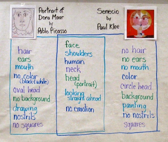
With the idea that I would have students do some "mystery paintings" of faces.... white crayon on white paper with watercolor resist overlay.... I started out by having them compare two works, one by Pablo Picasso and one by Paul Klee. I chose these two works because I intended to have them do a contour drawing of a face and then use color blocks of watercolor over the drawings, and these two works are perfect examples.

We started with my standard question: "What do you notice?" I charted the students' responses, encouraging them to identify whether their "noticing" was of the Picasso, the Klee, or whether it applied to both of the works. I asked students to use the artists' names rather than saying "the one on the left" or pointing and saying "that one" or "the round one" or "the pencil one." Those attributes that applied to both were charted down the center. Since these particular second graders are familiar with Venn Diagrams, they understood right away how to read this finished chart after I added the "boxes" around the lists.

On to the students' art making...

I started with a short demonstration of the "mystery painting" technique, drawing a large face with lots of lines for hair and showing students how I could almost see the drawing if I held the paper up to the light. I added a line pattern in the background for interest, and then modeled painting in blocks of color. I emphasized that I was not following the lines, but letting the drawing come through on its own as I painted.

Then I switched gears and decided to invite them to draw anything they wanted with white crayon on white paper. Together we brainstormed subject matter:  animals, flowers, landscapes, and... of course.... faces.

As they drew, I reminded students to press hard with the crayon and try to use the whole paper, either adding more to their subject matter or perhaps including a pattern in the background for interest. As they were ready, they painted over their drawings. 


These were just plain fun to do. Watercolor resist is a popular art-making activity and really does not need a lot of prep or explanation, but the introduction with these two art works gives an added art-appreciation and art analysis dimension to the lesson.

Looking at these two art works helps the students see how a face can take up a whole page, and to realize that one doesn't need to "follow lines" when painting. It also gives students the opportunity to see and talk about representational abstract art, and to become comfortable with the idea that a face drawing does not need to be absolutely realistic to be successful.

This art-making session ended with students writing about their art work. I gave them the choice of simply telling about their own process, describing how to create a "mystery painting," writing about the difference between Picasso's and Klee's faces, or comparing their own art work to either Picasso's or Klee's. Most students chose to just write about their own process, but two students did write comparisons... one compared his art work to Paul Klee's, and one compared the Picasso and Klee faces.

All in all, a successful lesson, during which a good time was had by all!


what can you do with a heart?

What can you do with any shape, really? One would think it's pretty easy to just decorate a shape... any shape... with lines, patterns, color.... but what I've found lately when substituting is that kids seem to be getting less and less creative at a frighteningly increasing pace. Giving them free reign with a blank piece of paper seems like such a good idea on paper, but I've found that many need a little push of some sort... some examples, some modeling, sometimes even a whole lesson, or at least a mini-lesson, on drawing patterns or borders.

One day in a second grade class, with a little free time to kill, I just thought I'd have students draw a large heart and make it beautiful. The word "decorate" just didn't seem right to me, but it was precisely that word that finally made the difference. I did do a little modeling to begin with, just to give them some ideas, and invited them to use as many colors as they wanted, as many designs as they wanted, and to fill the paper completely.

One of the only requirements was that they had to draw the heart freehand, so we would have a variety of heart shapes, not a set of cookie cutter hearts all the same. I wandered around as they were working, suggesting that they think of patterns they could use, and giving a hint now and then about using bolder colors or perhaps outlining the heart for emphasis.

It was interesting watching them work. While most of the students really got into it and showed some thought in their designs, a few seemed at a complete loss as to what they could do with their heart. When I teach art lessons to kids, I always emphasize how artists usually create a plan, think about what they want to do and choose colors carefully. There are so many times that I see students just slap something together, or don't really look at the space they have to work with. It's very intriguing.

In the end, the results of this activity were interesting. We only worked with crayon on this particular day, but if I had planned it out beforehand I might have had some watercolors available, or some scraps of paper, especially decorative paper, for them to use to enhance their hearts even more. I might have done more modeling (as much as I hate to!) or a short lesson on patterning, or bordering, or ways to combine different types of lines. I guess I just really believed they would do all that all by themselves. They did produce some fun designs, and they had a good time, and maybe that's the best thing.

The most interesting thing of all to me in this whole lesson is that this is the same class that created some beautiful Zentangles just a few weeks before. I fully expected that would carry over to this activity, and it did not, but maybe that's ok too!


just plain fun... and a little geometry!

 On a day when I was subbing in a second grade classroom, wanting to do an art activity but not in the mood to bother with a full-blown lesson, I decided to focus on shapes and patterns. Usually when I do a patterning lesson, I get into a whole "math chat" mode and ask a lot of questions about what patterns are, how we know, and other identifying information. This time, I just put up a sheet of butcher paper, labeled it "Patterns in the Classroom" and asked students to describe, with words, patterns they could see around them. The key here was describing with words. I specifically asked them not to indicate what they were looking at, but simply to describe a pattern they found. As they described what they saw, I drew the patterns, as I understood them, on the paper.

Once we had several examples, I talked about how even if what I drew wasn't exactly what students saw, we still ended up with some interesting patterns. U explained that is called "getting an idea" or "getting inspiration" -- that the patterns they saw could be changed to create new patterns.

The actual art-making part of this activity was very simple:  Trace some shapes onto white paper (I had brought my collection of cardboard and plastic shapes with me) and then color in the resulting spaces.

I introduced the words overlap and intersect and modeled tracing a few shapes to demonstrate the meanings of the words. I made sure students understood that each shape needed to overlap at least one other shape, so that all the lines would intersect. I then explained that each resulting shape/section would need to be filled with a pattern, and that no pattern could be repeated. And just to throw in another math concept, I asked them to trace an odd number of shapes, more than two and less than ten. They traced the shapes with a pencil first, then colored the spaces in, and then went back and outlined each original shape with a black crayon.

Students had cleared off their tables, so I just tossed a lot of assorted shapes in the middles of their tables and they went to work. As they got down to it, the classroom became quieter and quieter. There was some real concentration going on! A few students were not working real carefully, so I reminded them to be sure to think about what they were doing, and to slow down. I always tell students who rush that I am going to want their work to look like they were thinking about it. That generally works.

This was an easy, easy lesson that needed no prep at all. It would be great for a substitute (well, I was substituting!). I happened to have shapes with me, but I would bet that in most primary classrooms one would be able to find some shapes to trace. If not, students could make their own, with each student making one shape and then all students at that table sharing each others'. And there's no rule that says they have to use geometric shapes, but I do think the resulting shapes from overlapping are very interesting and it would be a great math extension to have them name all the resulting shapes, or some additional art concepts could be included by having students use all warm or all cool colors, or some other defined color combination.


learning to cut

Third day of school.
Kindergarten.
Choose a color.
Cut into strips.
Glue onto black paper.

I can't begin to count the number of second and third grade students I've seen in the past few years who could not efficiently use a pair of scissors. So when working as a support helper for the first three days of school in Kindergarten, I manned a center where the kids only needed to cut. Not on lines, not on shapes, just cut.  I showed them how to use the scissors -- thumb in the small hole, fingers in the big hole -- and how to hold the paper -- vertically, with the scissors pointing to the sky -- and asked them to cut their paper into strips.

Each student was able to choose a color, and in a group of six, everyone had a different color (there were about nine bright colors to choose from) so nobody's strips got mixed up on the table. Everyone also got a sheet of black paper to glue their strips on, and to make things easy, I brushed watered-down white glue all over the black paper and they just needed to lay their cuttings down onto the wet glue. This job was all about cutting and nothing else.

I always encourage / teach kids to hold their paper vertically, cut pointing to the sky, and to turn the paper instead of the scissors. This helps them be able to see exactly what they are cutting, because the paper and scissors are at eye level. This is particularly important if they are cutting on a line, or cutting out a shape, but for this activity, there were no lines to follow at all, so each child was able to just cut their strips the best they could. I gave no directions on how to glue them on the paper, and it was interesting to see how the children had different methods for gluing, some being very meticulous and orderly, others gluing the strips in a more haphazard manner.

When they were all finished, we had a beautiful assortment of line art, all ready to go on the wall. Even though each child had the same directions, no two of these were alike. I think they made a perfect first art activity!


about art materials

When I taught art in Kindergarten, 1st, and 2nd grades for two years, I had the luxury of a generous budget and was able to buy all the art materials I needed for a basic art curriculum. I didn't wander off into anything fancy; I stuck to the basics and the process of creative art-making. These days, I am retired and subbing in other peoples' classrooms, and I am intrigued (and sorry to say, not in a very good way) about the lack of quality art materials out there for kids to use. When it comes to buying art materials, my philosophy is to always buy the best quality possible. The cost may be initially higher, but the returns are greater: they generally last longer, work better, and produce much better results. I stick pretty much to the basics and stay away from most "specialty" items like glittery watercolor or tapping glue bottles. I follow this philosophy both for classroom art materials and for my own art-making process, because I want kids to feel like artists when they are making art, not to struggle with the materials they are using.

What do I consider basic? And are some brands better than others? Does it really matter what brand you buy?  You bet!  My favorites...


CRAYONS.   Good quality crayons have better color, probably due to the ratio of pigment to wax (I'm not a crayon scientist, so I'm guessing here). Poor quality crayons have more wax and the colors are not as bright, no matter how hard you press. I won't buy anything but Crayola. The reds are bright. The yellows are strong. Many teachers buy cheaper brands and my experience is that the colors are just very bland. And by the way, I want the colors to be named what they are. I came across some crayons in a friend's classroom that had color names like Blueberry Swirl or Grape Soda (I am making those up, but you get the gist), which are very cute and all, but were not even that accurate. Colors have names and don't need to be cutified. I like that Crayola names their blues Indigo, Blue, Cerulean. These are real names that artists use.

CONSTRUCTION PAPER CRAYONS are great to have on hand. They are made for drawing on dark colored construction paper. They have some kind of reflective material in them. Kids love using them! They are made by Crayola, and are wrapped with black paper so they are easily distinguished if they get mixed with regular crayons. For general storage, I like to keep crayons in zip baggies instead of in their boxes. It's easy for kids to find the color they need, and a whole class set will fit in one shoebox-sized plastic tub.

MARKERS:  I like Crayola markers for kids' use. They seem to last a pretty long time and the colors are pretty bright. I always store them with the tips facing down. This way, the ink is always saturating the tip and they stay nice and "juicy" instead of drying out. Laying them down in a tub works, also. For my own use, on charts and for art lessons where I do demonstrations, I use Mr. Sketch. The colors are very vibrant and the chisel point lets me make bolder lines so that the charts are easy to read. I like the smelly ones.

COLORED PENCILS:  Crayola again, although there are other brands that are pretty good, too. I like having a good supply of multiple, basic colors. I generally buy boxes of 12 colors and then dump them all in a plastic tub. They are great for still-life and other observation drawing.

GLUE STICKS:   I only buy UHU. It's firmer than cheaper glue sticks, doesn't clump or squish into a mess, and lasts a lot longer than any other brand I've used. I once put in an order for UHU glue sticks when I was teaching art, and the school secretary substituted a cheaper brand. I was working in three schools at the time, and guess at which school the glue sticks got used up first? These are definitely noticeably more expensive than other brands, but very well worth it in the long run. They have a "screw" top which I like. For some reason, kids seem to smoosh them less. Maybe because they are less smooshable.

WHITE GLUE:  Elmers.  The regular kind. Not the washable kind, the school glue kind, the clear gel kind (oh, that's the worst). Just the regular "Glue-All" kind. What I really really hate is those tapping bottles that drive me crazy when kids are doing collages. I think teachers buy them because they are tired of kids wasting glue, but it's not that hard to teach kids how to use small dots of glue. As for longevity, I always made sure to remind kids to close the stopper and wipe the glue off the tip, and then store the bottles standing up. It's that easy. The bottles will last practically forever.

SCISSORS:  I like "pointy" scissors, even for Kindergartners. They just seem to cut better. They seem more serious.  Fiskars makes a pretty nice pair of scissors for little hands, and they seem to work fine for either hand, so you don't need any special left-handed ones. 

PENCILS:  Dixon Ticonderoga. Nothing else will do. They are great for drawing. They have good, soft erasers. They sharpen well without breaking. They are worth the extra few cents per dozen. They last longer, write smoother, sharpen easier, and erase without smudging. I could write a whole blog post just about pencils. Another time. When the erasers go, as they will, I offer Pink Pearl erasers, not one for each student, but several stored near the pencil sharpener. (Which is a whole other post, but I swear by a good pencil sharpener.)

And last, but definitely not least .....  PAPER!  
I like good quality CONSTRUCTION PAPER, like Tru-Ray, because the paper is smoother and the colors are nice and bright. And by all means.... save all the scraps for collage-making!  It's a good idea to invest in some white DRAWING PAPER.  It comes in reams and is not too expensive. I like having both 9x12 and 12x18 on hand. It can be used when construction paper is not really needed but copy paper or newsprint is too thin. Regular, ordinary COPY PAPER is great for pencil drawing. It's nice and white, relatively inexpensive, and looks great on the wall in a gallery. Under no circumstances would I ever use any kind of newsprint for art lessons. Ever. Not even for sketching. It's just too ugly.

***
FOR BEST RESULTS, TREAT STUDENTS LIKE ARTISTS

If you buy the best you can afford, or even go a little over your budget, it will pay in the long run. When the budget is limited (and when isn't it, but I mean seriously limited) and you're tempted to buy cheaper materials, consider buying less units and get higher quality instead. Maybe it's better to have 10 boxes of high quality crayons and have kids share, than to have 20 boxes of poor quality crayons with drab color. Maybe it's better for three students to share a good stick of UHU glue stick than to have each student have their own stick of gooey, messy substandard glue stick. Every student does not always need their own everything.

Treat students like artists, and maybe they will make great art!

Enjoy! Create!

.

about sky...

I am always intrigued by the way kids will tackle sky. Often, they draw puffy clouds and then color them blue, leaving the "sky" part white. I will ask, "What color are clouds?" and they always say, "white" and I just say "hmmmm... yes they are...." and wander away, leaving them to ponder their blue clouds. So one day I decided to teach second graders a sky technique.

I started by having a discussion about what the word "landscape" means and what we might see in a landscape. I had them all look out the window and describe what was closest to the classroom (a few trees) and to notice how large they looked compared to the ones far away across the field. I had posted a sheet of 9x12 white paper on which, with a black Sharpie, I drew a couple of trees, fairly large. Then I asked what else might be there: Rocks. Water. Grass. Flowers. Bushes. I put in some of those things. Then I added some low hills in the background, then another layer of hills behind those, and some mountains behind those. 
I then colored in the sky with a broken, unwrapped crayon, using the side of the crayon and leaving some spaces white to suggest clouds. Their reaction? "Oooohhhh....." Another thing I modeled was using the sides of the broken crayons to do some "blending" in the foreground.

I gave them directions to draw a landscape, including hills and mountains in the background, by starting with the foreground and working back. They were to use a Sharpie (so double paper to keep the desks clean) and not color anything in while drawing. After they had the landscape finished, they were to color some of the landscape while leaving some parts white, and create their sky the same way I did. I decided to ask them to leave some parts white partly to save time and partly to focus on their drawings without getting them obliterated.  A few students tried the blending technique while they were coloring their landscapes.

The results were colorful, interesting, and fanciful.

They did a great job and I learned something, too. Most of the kids drew the tops of their mountains near the top of the paper, leaving very little sky space. The next time I try this, I will make sure to emphasize that they leave at least 1/3 of the space for sky. All in all, though, I think they did a great job! And they had a good time, too.

heart tangles

I was scheduled to do an art lesson for fifth grade yesterday and was not really sure what I wanted to do. I hemmed and hawed for a couple of days and then the night before the lesson, I couldn't sleep, and I came up with these. I call them HeartTangles.... basically just Zentangles with a heart superimposed over the design, colored in with warm or cool colored pencil.

I actually started the lesson with an incomplete sentence:  "Being Creative means...." and listened to some very wonderful ideas. I have to interject that this particular fifth grade class was fortunate to have periodic art instruction (by me) all through Kindergarten, first, and second grade. I was really tickled and blown away by their responses (see the charted responses below). Best of all, some of their ideas were a perfect segue into the Zentangles Hearts lesson.

To introduce the lesson I just put up a sheet of paper and started drawing, saying nothing. I worked very slow and meticulously, never taking my eyes off the paper, for about three to five minutes. Then I turned to the kids and asked, "What was I doing?" and again, they had great responses:  Focusing on my work. Working slowly. Making one long line. Concentrating.

It was time to hand out paper and let them begin. Suddenly, you could hear a pin drop. There was no sound at all for the longest time.

When the first person had filled the entire page, I stopped everyone and introduced the heart part. First I had them free draw many hearts on a blank piece of paper, all sizes. Then I gave directions for drawing and cutting a heart out of tagboard, tracing it on their design, and coloring it in using warm or cool colors. I put out everything they needed, and just watched them work.

This was a wonderfully relaxing day! The entire lesson/activity took just under two hours, and everybody did a great job!